Your brand is a form of relationship management
According to Demand Metric, branding leads to a bottom line increase in revenue between 10 and 23%. The key driver is consistency within the marketplace which leads to recognition, trust, and ultimately more uptake. The underlying factor is that customers feel like they ‘own’ the brand – they align themselves with it and are proud of it.nike air max new custom softball jerseys nike air max 270 sale cheap wigs for sale adidas yeezy foam runner onyx nike air jordan high tops wig sales nfl jersey sales cheap human hair wigs adidas sneakers women adidas outlet online cheap human hair wigs nike air jordan high tops nike air max 90 adidas outlet
Although branding can seem superficial when starting a small business, growing a loyal customer base is something that ensures that your business thrives. As an online marketing services company, we have seen that the more recognisable your business, the easier it is to grow and keep your customers.
What’s the key behind an iconic brand vs one you can’t remember?
- Recognisable logo at any size (think bus vs facebook icon)
- A brand has values that clients know
- A strong brand communicates with their ideal clients
- A brilliant brand is memorable and clearly articulated
- A great brand has personality; eg. sexy, strong, futuristic, courageous
What is in a logo?
1. A Simple logo is essential
The art of making a logo is quite complex, because it needs to be simple yet memorable. Think of the Nike ‘tick’ and Apple’s latest silver Apple. They are simple icons, and each image is entirely recognisable and unmistakable.
“The easier it is to process things, the more we like those things” – Jonah Berger
For example, most of us know the Nike tick. It’s known as a ‘swoosh’, it evokes speed and wings (Nike is the messenger of the gods and has shoes with wings on them). It’s so simple, yet with trademarking it is unique.

If you’re wondering how simple your logo needs to be, imagine that it fits inside a circle, to proliferate your company’s presence on social media.
Examples of eye catching brands that stand out globally
2. Your Logo Must Evolve With Your Brand
This is one of the biggest disconnects in business. When a business does not continuously convey their brand effectively to their clients, usually because it is too complex, the brand will fail to be memorable. Although there are a few brands who have successfully complex iconography, those tiny details are progressively getting lost on devices and in icon and favicon form. Evolution of the logo and the brand together is key.
The evolution of the Apple logo shows the story of the clients the business served and the progression from niche to global. As the business grew from a local ‘apple off the tree’ to a far reaching brand of several products with future forward thinking, so the apple went from being a painting, to a friendly tree hugging rainbow to being a futuristic, minimalist and yet still (to my eye) a friendly icon.
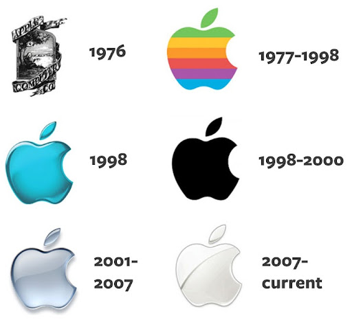
Apple has gone through quite a long birthing period, where the brand has moved consistently towards futuristic, more iconic iconography. Alongside this brand development is the evolution from build it yourself personal desktop computers to the product that now carries a distinctive ‘i’ pronoun.
You can see the evolution of the design as techniques evolved, and as Apple itself embraced its place in the future of technology.
3. Is your Logo Memorable?
Can you take one look at your logo and remember the details? Can someone who hasn’t seen it before tell you what your logo looked like after one quick glance? Ideally that’s what you want.
Think of the largest logo brands in the world, they have personality, yet they are simple and elegant.
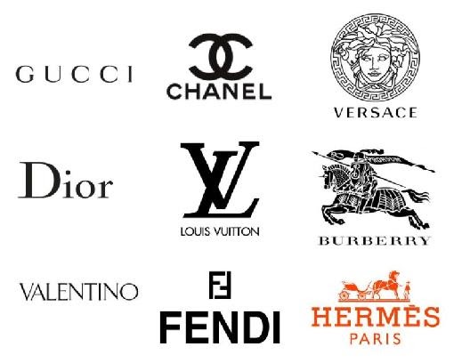
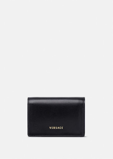
This gets even more obvious in the fashion industry and the car industry. Just take a look at how clean fashion brands are, often they are black and white and there is an extreme kind of simplicity, an aesthetic. While some brands hold a higher level of complexity visually, for example Versace and Burberry, the full brand is often replaced with just the name.
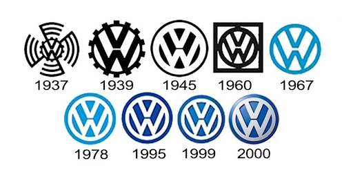
The same goes for car logos, which translate into silver ornaments or fixtures. I have a VW and just like Apple, Volkswagen has undergone a several stage transition from the early days until now. Of course, this brand has been around for a lot longer than Apple, yet it seems the transitions are remarkably similar. At first we have a complicated symbol, which progressively gets more simplified then finally takes on a slightly 3D look to become a future forward brand.
While we can’t predict the future of brand iconography, being driven by a simple colour palette or distinctive shape is key to customer recognition.
4. Is Your Logo Remarkable?
“If you’re an established brand, you may not want a remarkable logo. But if you’re a startup, you need to take a little more risk.” says Berger.
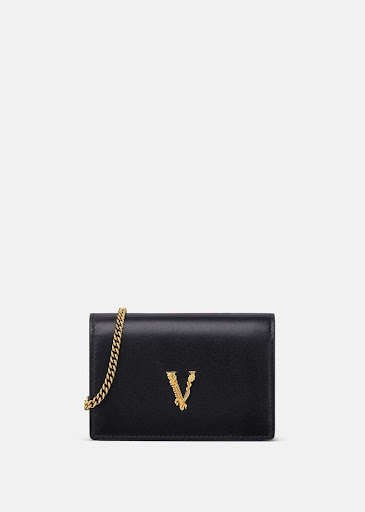
This means having a logo that is strong – and in today’s world that means you can see it in the icon on social media for maximum benefit. Now just think how tiny that little square is on Facebook on your phone – to nail that you’ve got to be pretty clear about what you offer and how to encapsulate it in just a small ‘swoosh’ or ‘apple’ or ‘polo rider’. Even some of the major fashion brands have logos that are too complicated for today’s fast paced world, and so they revert to the word only to gain meaning. For example Versace reduces from the logo above to a simpler form – either the name or just the V.
5. Market testing.
Jonah Berger, author of Contagious Things Catch suggests that market testing even for a logo is key. “Don’t just trust your gut when designing a logo”, Berger says. Do market research. Hway to test various logo designs is to put out a survey on a service such as Amazon’s Mechanical Turk.
“We could throw up a quick study for an entrepreneur for $10 and, within a day, get a lot of feedback from different people about how heavy or light, fast or slow a logo would be,” Berger says.
Given that you already have a following, or at least a sympathetic group of contacts, you can also ‘market test’ through social media on your Facebook, Instagram or Linkedin profiles. I’d recommend having some final versions, perhaps the last two or three variations before you ask the public. It’s actually relatively clear most of the time which logo people prefer. If you have more than four options, and a lot of ideas, this can lead to more confusion than clarity. My tip is to ensure a simple set of variations; for example a different colour palette or slightly different font.
6. Considerations on Logo Concept Direction.
Logos come in two basic forms: abstract symbols (like the apple in Apple Computer) or logotypes, a stylised rendition of your company’s name. You can also use a combination of both.
Alan Siegel, former chairman of Siegel+Gale, a design firm specialising in corporate identity, warns that promoting an abstract symbol can prove very costly for a small business on a budget. In addition, he says, such logos are harder to remember.
“A logotype or word mark is much easier to recall,” says Siegel. “If you use an abstract symbol, always use it in connection with your business name.”
7. Finding a Logo Designer
Trying to create a logo on your own may seem like the best way to avoid the high costs of going to a professional design firm, which will charge thousands for a logo alone. However, be aware that there are a lot of independent designers who charge much less.
According to Stan Evenson, founder of Evenson Design Group, “Entrepreneurs on a tight budget should shop around for a designer, but don’t hire someone because of their bargain price. Find a designer who’s familiar with your field and your competition. If the cost still seems exorbitant, remember that a good logo should last at least ten years. If you look at the amortization of that cost over a ten-year period, it doesn’t seem so bad.”
Final Advice – Make Sure Your Brand Translates
Even if you have a good eye for color and a sense of what you want your branding and logo to look like, we recommend that you consult a professional design firm, like ourselves.
You’ll need to have certain items – the logo in vector form (.png, .tiff, .ai) not just .jpg or .png. You’ll need your CMYK, RGB and Hex values for each colour, so that your logo doesn’t change colour when it’s printed or used in on a Tshirt, car or website.
A trained designer will know whether or not a logo design will transfer easily into print or onto a sign, while you might come up with a beautiful design that can’t be transferred or would cost too much to be printed.
Your logo is the foundation for all your promotional materials, so this is one area where spending a little more now really pays off later.
As a digital marketing company based in Melbourne, Australia, we offer logo design packages that are designed to give you the basics, then we add brand guidelines and further elements as the brand grows.
Resources
Entrepreneur.com https://www.entrepreneur.com/article/241956
Jonah Berger https://www.amazon.com/Contagious-Things-Catch-Jonah-Berger/dp/1451686587
Demand Metric The Impact of Brand Consistency Benchmark Report 2016